Similarities and Differences
Posted by Joshua Sharf in Uncategorized on September 27th, 2012
Music helps with the writing. Especially Bach. Ahhhhh, Bach. So I like to put on the Rhapsody playlist and let it run. It means I can’t give it the attention it deserves, so it’s mostly just background. Until this jumped out:
Why? Because I’d recognize it anywhere. From here:
This Mendelssohn piece has been one of my favorites since I heard it, almost 30 years ago. Now, up until Mendelssohn’s day, performers played new pieces, not old ones. There might be a few fan favorites that hung on, as appetizers for the new stuff, but by and large, people didn’t go to concerts to hear covers. Mendelssohn organized the first retrospective – a concert of Bach. So he obviously thought a lot of the old master. So much so that he apparently didn’t mind quoting this fairly obscure passage in what would go on to be a blockbuster hit capable of moving people 200 years later.
Then, there are the Canadians who are apparently insecure about their independence from Britain, at least insecure enough to think that the rest of the world can’t tell the difference between them.
I can promise that even benighted Americans, who can barely tell the difference among non-English-speaking foreigners, never mind muster the Henry Higgins-like skills necessary to distinguish among the various Southern Hemispheric English-speakers, can figure out the difference between Brits and Canadians. Working at home, I like to have the TV on for background noise, and for a while, one of the cable channels was running “Wind At My Back.” It’s the sort of anodyne, inoffensive production you get from most BBC government-funded “art.” Only in this case is was the CBC, and I never once thought it was set in Kent. (Canadian TV is a lot closer to home, but never gets the same play here as British stuff, probably because PBS doesn’t have a long-term player development contract with it. Maybe they only license the French stuff for export.)
It’s only a space-sharing arrangement, but there’s no reason that it couldn’t be replicated with other Anglospheric countries, and even extended to routine administrative matters, without compromising sovereignty. You want to build up a new and improved Commonwealth, it’s going to start with little things like that.
Which leads me to Revolution.
If you’re of a certain age, and grew up at any point during the Cold War, you imbibed your share of dystopian futuristic science fiction. A lot of it was crap, like “The Day After,” produced mostly to remind everyone of how big a risk they had taken by electing Reagan in 1980, and how they would soon have a chance to fix that and avoid the end of the world. It came out right around the same time as the “Weinberger for President: Let’s Get It Over With” bumper stickers, with little mushroom clouds. Nobody would confuse it with “Threads,” an even more hopeless vision, but one that for all that stuck with me long enough to give me nightmares. It was British, of course. The basic thesis of all of these was the in the aftermath of a nuclear war, civilization was doomed and you were pretty much better off saving the effort and using the first bullet on yourself. Which isn’t nearly as interesting as a world where life goes on, is it?
And a few years ago, I interviewed One Second After author William Forstchen on the air. It’s about the after-effects of an EMP attack on the United States. My sister had gotten me the book as a present, and my immediate reaction was that I was delighted to have gotten the book, and really sorry to have read it. One commentator on NPR ridiculed the idea of an EMP attack (“What, they get a nuclear bomb and they’re going to use it to turn off our lights?”), but it was clear he hadn’t really thought about where he got his tapwater from. The book thinks through the consequences, and they’re not, really not, pretty.
A quick search shows that the publicists have been hard at work, and the show did get some advance reviews after the carpet bombing we got during the Olympics. There’s every incentive, though, for the MSM to ignore or downplay or even ridicule the notion now, because scaring people now works against their preferred candidate, not in his favor. Of course, it doesn’t have to come from an attack. It’s possible that a massive solar storm could do the same thing, and we’ll never know what that commentator has to say then, because he won’t be broadcasting it.
They won’t be broadcasting Revolution, either, which is probably a blessing.
Look, the biggest problems after an EMP-led outage are going to be food, food, food, and water. We’ll lose a lot of people who are dependent on the easy distribution of drugs and medicine, but for those left, there’s just no getting around the fact that once the trains stop running, there’s just not going to be a lot of food coming from the farmland into the cities. And if the EMP also takes out the major farm equipment, then it’s really Welcome to 1850, because the farmers are going to back to that level of technology, too.
It makes the whole premise of one of the main characters completely implausible. There’s just no way that 15 years after “The lights go out,” as the euphemism has it, a chubby ex-Google programmer with no identifiable practical skills is still around.
The show also tips its hand in the first 15 minutes. Just like the theme of the original Battlestar Galactica was the quest to find Earth, this one’s going to be about whether or not one of the main characters can use the information stored on a thumb drive to “turn the lights back on.” Too much happens, and there’s not enough build-up for any of the reveals to have any payoff. The main character is looking through an old stash of postcards of major cities, and one of them is of Wrigley Field. Voila! One segment later, she and her compadres are walking past a dilapidated Wrigley Field where the outfield vines have clearly gotten well out of hand. We have no idea how far they are from Chicago, they barely pack anything for this life-threatening excursion, there’s no sense of adventure in the journey, so there’s no emotional payoff when they finally get there.
Doing it this way makes it too easy for the writers to pop up some convenient obstacle when they need it.
I know Firefly got cancelled, but I still think that it and Babylon 5 did it right. Set up the world, skip the history lesson, and use the first season to tell basic stories about what life in that world is like. Save the long-arc stuff until you’ve got the characters and the universe established. (Yes, I know Serenity used the same conceit of a history lesson to kids, but that was a movie, where you have to establish what’s going on immediately, or have the audience spend the whole time trying to put the pieces together and follow the storyline at the same time.) Tell interesting stories each week, while giving us some sense of what to expect. That approach also means you have to sketch out the world in advance, and really do your homework.
Too bad they didn’t have time for that.
June 1998 Video of Obama on Political Coalitions and the Working Poor
Posted by Joshua Sharf in 2012 Presidential Race, National Politics, PPC, President 2012 on September 24th, 2012
The Daily Caller has posted the unedited audio of then-State Senator Barack Obama at a Loyola College forum, where he discusses the importance of uniting the working poor with welfare recipients as a political coalition.
Turns out this wasn’t a one-off, or a cool idea that occurred to him in the middle of the forum, but something he had been thinking about for a while. Here’s C-SPAN video of him at a Brookings Institute forum on the State of the Cities four months earlier, on June 14, 1998:
Why is this problematic? Traditionally, the working poor haven’t identified with welfare recipients, but with the middle class, just as the middle class tends to identify with the rich. They tend to see themselves as hopeful and upwardly-mobile. By getting the working poor to see themselves as having more in common with recent welfare recipients, Obama is hoping to get them to believe that they need/want/are entitled to government help that they might not have sought otherwise, and to form a voting bloc in favor of expanded government redistribution.
The Summer Game in Fall
Posted by Joshua Sharf in Baseball, Movies, Sports on September 23rd, 2012
The Saturday night movie was “Trouble With the Curve,” the latest Clint Eastwood offering. A rom-com with professional complications and a baseball backdrop. You can’t screw up baseball – the owners have proven that, try as they might – but you can make a predictable, formulaic rom-com, and that’s what they’ve done here. It’s not exactly paint-by-numbers, but they’re not painting the corners, either. The characters are, for the most part, barely one-dimensional and overplayed, at that. Even the final, dramatic showdown between pitcher and catcher misses an obvious trick.
The movie aspires to be a sort of anti-“Moneyball,” with Clint playing an aging scout who thinks his eyes and ears can tell him stuff that the kids’ computers can’t. That baseball is cruel and unfair won’t be news to fans. But that it compounds the normal cruelty of high school athletes may come as a surprise to some. The games are what they are, but the action for the scouts isn’t in the results, but the process. The reason you need scouts for high school is that any major league prospect is going to so outclass his competition that the results at that level don’t suffice to distinguish between prospects and true star power. But remember, in “Moneyball,” the whiz kids weren’t using SABRmetrics to scout high schoolers, but under-valued major- and minor-leaguers. So the portrait of baseball resembles an Escher drawing – the details are right, but they’re placed in a world that doesn’t exist.
Clint and Amy Adams as his daughter turn in nice performances, as does Justin Timberlake, and while neither of the two younger actors has the resume of Eastwood, they can hold their own on the screen with him. Eastwood is smart enough to know that actors bring their body of work with them to whatever new roles they play, and some skillful use of some footage of a younger Clint helps allude to the outside-the-rules Eastwood that we all remember.
Two, maybe two-and-a-half stars. As usual, the real game is better.
Especially when your childhood team is finally playing meaningful ball in September. In this case, that’s the Orioles. September 2007 was magical here, and I was working a block away from Coors Field. I got to see a couple of Rockies wins during that stretch, saw the play-in game against the Padres, and saw the two NLCS wins against Arizona, including the clincher that sent them to the Series. But there’s nothing quite like seeing the team you rooted for as a kid go to the playoffs.
I subscribe to the MLB.com radio broadcats at something like $15/year, and Joe Angel is back doing the games after a purgatory in Yankeeland. In fact, even as I write this, I’m listening to the Orioles broadcast, and watching the Yankees play the A’s on TV. Would that it were the other way around, but TBS seems to have some sort of contract that requires them to show Yankees games.
On the rare occasions that the Orioles have been on television it’s been fun to see Camden Yards full again,and the ads for local brands that I had forgotten about, like High’s Ice Cream. Camden Yards was the first of the retro ballparks, and still one of the best, with the warehouse in right field, and the Bromoseltzer Tower in past center. It replaced one of the other trendsetter parks, Memorial Stadium, which doubled for the Colts, and really long-time Orioles fans watched a lot of games there.
So one thing that’s been a little disheartening is the crowd cheers. In Memorial Stadium, there was a guy name “Wild” Bill Hagy who used to lead a cheer from Section 34, spelling out “O-R-I-O-L-E-S” with his body as the crowd shouted out the letters. There’s even a blog named for it. Now, it’s basically the same soundtrack as here in Colorado, so it’s probably the same soundtrack as most parks these days. I know “franchise” implies a certain uniformity of product, but I don’t think that means that the experience has to be the same at every ballpark. You want to think there’s something different about your team, that just because the players are interchangeable these days, doesn’t mean the teams are.
You like to think that the team’s success is the payoff for all those old fans who’ve suffered through 15 years of losing seasons, and then you realize that by definition, there just aren’t that many who will stay interested through that kind of a spell. And when you talk about a cheer they haven’t used in 20 years, you sound like the guy 20 years ago who was reminiscing about how hard it was to pick up the ball against the white shirts in center field in Memorial Stadium.
But you know, who cares? O-R-I-O-L-E-S!
Forward! To The 1870s!
Posted by Joshua Sharf in 2012 Presidential Race, History, National Politics on September 23rd, 2012
A lot’s been made in the last few days about the new Obama campaign “flag,” which replaces the 50 stars with the Obama campaign symbol. (After all, who need 50 stars when you can get by with The One?) As a counterpoint, some on the left have taken to posting Lincoln campaign flags, and a few of my friends on the left haven’t been above calling conservatives names over their outrage. It turns out it wasn’t just Lincoln who did this – it was a fairly common, almost standard campaign motif from about 1840 to William McKinley. I’ve collected a slideshow (although those of you reading this in email will need to go to the site to see it):
Then, starting in the very late 1800s, around about the same time that we started to take our place on the world stage, our attitude about the flag started to change as well. In 1898, the poem, “Hats Off!” was published. It was still current as late as the 1960s, when it was being republished in a book I read as a kid. The Pledge of Allegiance was published in 1892, as well. (Ironically, Francis Bellamy was a Christian socialist, but nowadays it’s the “right-wingers” who open meetings with it. It was written in the days when American socialism was more nationalist, and less Internationale, I suppose. Good thing they dropped the salute, though.) And in 1924, the Code of Conduct for the Flag was finally enacted, about a generation after the flag’s started to become a more venerated symbol. By that time, of course, putting your picture on the flag had long gone out of fashion.
Does this mean that the Obama campaign flag is much ado about nothing? I don’t think so. I was never outraged by the appropriation of the flag, but I did consider it to be just another example of the creepy cult of personality that Obama seems way too comfortable with, and which is completely inappropriate for a sitting president of a democratic republic. Harsanyi missed this year’s DNC logo, a stylized Obama campaign “O.” I looked back at convention logos of both parties from 1980 onward, and didn’t see anything remotely like that for either party. He also didn’t mention the other weird stuff, like making an “O” with your hands in 2008, and the Obama Campaign Wedding Registry.
We’ve lionized presidents before, but usually after they’ve left office. Lincoln, FDR, Kennedy, and Reagan come to mind. Three of them died in office, three led us through decisive moments in major struggles. (JFK’s persists to this day. I was looking at a poster of presidential portraits in DAT this morning, and while almost all were the official presidential portrait, Kennedy’s was of his standing with his hand on his desk, head bowed, in a golden haze, which struck me as a little over-the-top. Fifty years on, that sort of thing isn’t doing anything to encourage serious appraisals of his time in office, is it?) But I can’t remember anything like this for a living President, and Obama’s the eighth one I’ve been conscious of.
Certainly the way that Obama did this is different from what came before. In some ways, the redesign does more violence to the flag than the portraits did. The Obama “O” is a paler shade of blue, cyan really. And the previous presidents and campaigns at least kept the stars there, rather than replacing them entirely. But I’m sure that if he had put his portrait, or a stylized, dark blue monochrome of the Sheperd Fairey poster there, and kept the stars, it would still have been weird. It’s not just about the design elements.
My friend State Senator Shawn Mitchell put his finger on it when he said that campaign symbols, indeed any political symbols, are created in a particular time and a particular environment. In the 1870s, people were used to seeing this sort of thing. Now they’re not.
The claim that this is just reviving an old tradition of flag redesign doesn’t ring true, not in today’s context. A lot’s changed since the late 19th Century, and how we think about the flag is only part of it. Maybe it was more acceptable when the Republic was younger. Maybe there was a recognition that the presidency was itself, in some way, a national symbol, and that in the days before the federal government has usurped so much of the states’ powers, there was less danger in any one individual who occupied the office.
So how about a deal. We’ll stop complaining about Obama “desecrating” the flag, if they’ll pare back the Federal Government to the scope it had in 1876.
Referendum Confusion
Posted by Joshua Sharf in Taxes on September 22nd, 2012
I’ve been posting recently on the proposed mill levy and debt increase for Jefferson County called 3A/3B. Denver Public Schools has similar measures on the ballot, also called 3A/3B. My post the other day about the accumulating debt burden on Denver School District voters was interpreted by some to be about the JeffCo measure.
That’s ok! The identical naming makes it easy. If you’re in Denver or Jefferson County, vote against 3A/3B!
Denver Schools Back For More
Posted by Joshua Sharf in Colorado Politics, Denver, Taxes on September 20th, 2012
Whenever the schools teachers unions come back for more, they always want you to forget how much they’ve taken in the past. This year, Denver Public School are proposing both a tax hike, and a debt issue. We’ll look at the tax hike another day. What many people don’t realize is that DPS has been borrowing like they had the Fed at the other end of the line (which they sort of did). Over the last 10 years, the bonded debt per capita has almost doubled, and the proposed $466 million increase would, I estimate, raise it almost another $700 per person.

That alone doesn’t tell us much, though, about our ability to pay this debt. The debt is funded through a mill levy on personal property, and is therefore limited based on the total assessed property value in the district.
So to consider how affordable and wise additional debt is, we should look at the ratio of Debt/Assessed Value – in effect, how mortgaged is your property for this debt?
But unless someone annually rolls their property tax into their mortgage, though, they have to pay it out of current income or savings. Which means that it’s also important to consider the debt as a percentage of total personal income. The charts below show how those ratios have risen over the last ten years, with the dashed line estimating how the additional $466 million would increase these ratios:
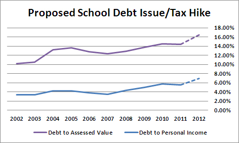
Both ratios have risen, and would rise dramatically on passage of 3B. Note, though, that the burden on income is rising faster as a percentage basis (vs itself) than the burden on assessed value. The property tax is a regressive tax. While it’s nominally paid by the property owner, they really pass it on their renters, so the burden rests on the entire city. This chart shows that while the debt burden for the school district has been rising as a function of assessed value, it’s been rising even faster in terms of people’s ability to pay.
The DPS and the CEA will always argue that they need the marginal increase. What they won’t tell you is how these marginal increases add up over time.
Note on data sources: The Denver Public Schools, like all Colorado Public School districts, is required to file a Comprehensive Annual Finance Report. It gives the Net Debt for the school district, and also calculates the per capita, and the other ratios. But it only had that data through 2008. While the BEA calculates total personal income at the county level, its latest data was for 2010. The BLS publishes a total wages number at the county level, though, and had numbers through 2011. The ratio of the DPS’s reported total personal income for the county to the BEA number was 1.24, with a standard deviation of 0.02, so I decided to use the BEA numbers multiplied by 1.24 for 2002-2011. With current reports showing wages in Denver declining slightly, and employment static, I plugged in the 2011 number for 2012.
For the 2012 Assessed Valuation, I used the 2011 Assessed Valuation plus 10%, which is about what the Case-Schiller is showing for the Denver area.
For population, I used the official Census estimates for Denver, and then added 16,000 to the 2011 estimate for 2012. These differ somewhat from the population numbers used by DPS.
For the total debt, I simply added the $466 million requested to the latest 2011 Net Debt reported by DPS.
Iran’s Latin American Bases
Posted by Joshua Sharf in Iran, War on Islamism on September 16th, 2012
Israel Radio reported a couple of weeks ago that Iran and Hezbollah had established a base inside of Nicaragua, near the border with Honduras. (Naturally, this has received zero attention from the American press, with the exception of Investor’s Business Daily.) This is apparently an extension of Iran’s presence in Venezuela. Obama’s claims notwithstanding, Hugo Chavez seems determined to prove himself a menace to the US. And those who claimed that our old nemesis Danny Ortega, had turned over a new leaf, have been deceiving themselves. (Many of us cheered the old Marxist’s fall from power; P.J. O’Rourke’s chapter on the Nicaraguan elections in Holidays in Hell is priceless.)
It’s perfectly reasonable to assume that Hezbollah isn’t using a Latin American training facility to prepare for operations against Israel. They have most of Lebanon at their disposal for that sort of thing. The options for operations here in the Americas are multiple. There’s a growing Muslim community in South America, portions of which could presumably be incited against US diplomatic facilities. The operatives could directly target Mexican natural gas pipelines, or, given the porousness of the US-Mexican border, be bound for targets here in the US. Also, given Hezbollah’s involvement with the Latin American drug cartels, they could be training to help reinforce those efforts, or to provide additional training to those cartels in their fights against the Mexican and/or US military.
In fact, Iran’s presence in Nicaragua is not a new development. Todd Bensman had been covering this story as far back as October of 2007, and we had noted it here on this blog at the time as something to be concerned about. At that time, Iran was establishing a large, outsized presence in Nicaragua under diplomatic cover, claiming that it was there to promote economic development. Anyone with an ounce of sense knew at the time that this was a precursor to something more serious, and now, that something more serious seems to have arrived.
Taking Responsibility
Posted by Joshua Sharf in War on Islamism on September 14th, 2012
If there’s one thing President Obama hasn’t been good at, it’s taking responsibility. But it seems as though, in the matter of the anti-Muslim YouTube video, he may just have done so, and in the worst possible way.
Obama’s and the State Department’s line from the beginning has been threefold:
- We think the video is a miserable and offensive production
- The riots were a spontaneous response to the video
- It’s not the government’s position, and we didn’t have anything to do with it
On Point #1, there is near-universal agreement, although for reasons that I’ll discuss farther down, it’s questionable as to the wisdom of the US Government expressing such an opinion, and the way that they did comes pretty close to the acceptable limits.
Point #2 is absurd on the face of it. All evidence is, and has been for some time, that the attacks were planned, and two overseas newspapers have reported that the US Government had warning in advance that something was up. To what degree that intelligence was specific enough to be actionable is a matter for a Congressional investigation and another day. It, along with the high degree of organization in the Libyan attack, help to establish that these attacks were anything but spontaneous.
Point #3 is where we start to get into real trouble, because even if it’s true, it’s far from clear that you want the US Government saying it.
A lot has been made of the migration of money away from political candidates’ official campaigns and to PACs and now, SuperPACs. This can cause the candidate to lose control of his message, since there’s not supposed to be any coordination between the campaign and the PAC. But it also gives supporters of a campaign latitude to say things that the campaign could never say, or shouldn’t say, and the non-coordination law gives the candidate the ability to wave away questions about PAC ads that might be edgy or even in poor taste. In fact, it’s critical that the candidate do that, because as soon as he starts to question things his supporters are saying, he can be held responsible for their saying it.
While the video isn’t responsible for the riots, the riots can become a lever by which Arab and Islamist government move the US in the direction of self-censorship in the matter of Islam. This has long been a desiderata of these governments, and one which the US has resisted, certainly better than European countries. Which is why it’s so important that Obama and Clinton (and through Carney and others), make the appropriate response.
Now comes word that the US government is “asking” YouTube to review the video and re-decide that if it violates YouTube’s terms of service. As lousy an idea as this is under normal circumstances, it runs afoul of the cardinal principle that not only can’t the government stop its people from talking, it has no moral right to, and doesn’t want to.
By putting pressure on YouTube to shut up, it’s tossing away all of Point #3, and putting us at risk for greater pressure down the line. By saying that it does have the power to prevent certain kinds of speech on the basis of content, it also implicitly assumes responsibility for the kinds of speech it chooses to deal with. If it claims that it doesn’t like something someone said, outsiders can ask why they don’t pressure YouTube, or whatever platform, to remove it. If the government chooses not to do so, claims that the government must really agree with what’s being said (or at least, really like who’s saying it), gain currency. Not only does it constrict the bounds of acceptable speech, it also has the potential to tie up the US government’s diplomacy.
One might question whether or not this is an appropriate “teachable moment,” as the lefties like to say, for anyone in the Arab world. And yet, I would have a preferred a response from our State Department that focused on the virtues of open and robust debate, with the occasional abuses of that right, to one that focuses on the helplessness of the the US government to control the speech of its citizens.
Investing in School…Bonds
Posted by Joshua Sharf in Colorado Politics, Education, Finance, PPC on August 16th, 2012
I’ve written before about the proposed Jefferson County Schools mill levy increase, issues 3A and 3B, which will be on the ballot this fall. The committee supporting the measure is named Citizens for JeffCo Schools (sic), and according to EdNews Colorado (confirmed by TRACER documents), it has raised a little under $50,000 this year. Twenty thousand of that comes from Robert W. Baird, an investment bank based in Wisconsin. Another $15,000 has come from FirstBank, meaning that the remainder of small contributions – under $15,000 – is less than the $15K from FirstBank.
Robert Baird, as it turns out, is the district’s investment banker, confirmed in the minutes of the June 14 School Board meeting (available here). This means that should the bond pass, Baird stands to make a fair amount of money underwriting the refi.
This cycling of money by investment banks back into bond referenda that they stand to benefit materially from is extremely distasteful, and has gotten attention before.
Someone should ask the 3A/3B proponents about this.
UPDATE: Go to JeffCo Students First Action to see what you can do to stop this measure.
How Does PERA Rate?
Posted by Joshua Sharf in Budget, Colorado Politics, Finance, PERA, PPC on August 15th, 2012
Not well. According to its latest Comprehensive Annual Financial Report, PERA has an unfunded liability of $25 billion, up from $15 billion last year, mostly because of a dismal rate of return in 2011, roughly 1.9%. Much of the criticism of public pensions has centered on their unrealistic expected rates of return, 8% in PERA’s case. This is certainly a cause of concern. While 8% is not unrealistic for equities historically, most people consider it to be wildly optimistic, certainly for the near future. And in any case, a constant rate of return doesn’t take into account the volatility of those returns.
But there’s a second rate, the discount rate, which PERA also has to estimate. It signifies something else altogether, and like the discount rate, PERA’s assumptions regarding the discount rate serve to make the fund look more solvent than it actually is.
What is a discount rate?
Another term for the discount rate is the “required rate of return,” not by the plan, but by the investors in the plan. In some sense, you can think of it as the Rate of Return in reverse.
The Rate of Return is used to estimate how much today’s investment will be worth tomorrow. PERA assumes an 8% rate of return, and for the moment, let’s humor them. This means that $1,000 today will be worth almost exactly $10,000 in 30 years.
The discount rate works in reverse. If I know that I’m going to need $10,000 in 30 years, then I can run that number in reverse, discounting by 8% each year, until I see that I need $1,000 in the bank today to be able to meet that obligation.
PERA, like most government pensions, uses the assumed Rate of Return as the Discount Rate. If you have $1,000 in the bank, after all, you have enough to cover a $10,000 obligation.
Why not?
Because in this case, the discount rate is supposed to discount back obligations, not assets. It is suppose to represent the required Rate of Return of the investors, in this case, the pensioners. And since the pensioners’ assets (their PERA benefit) is the same as PERA’s obligations, PERA should use the Rate of Return that pensioners should expect on their investment.
What rate is that? Basic economics says that risk needs to match return. The market should price assets with the same risk at the same Rate of Return. Otherwise, for two assets with the same risk, an investor could sell the one at the lower rate of return, and buy at the higher rate, and not have any risk at all. Obviously that’s not sustainable.
So the trick is to find an investment with roughly the same risk as PERA, and use its return as PERA’s discount rate. PERA is a contractual obligation by the state, much like a long-term bond. It can probably change the terms of PERA more easily than it could default on a long-term bond, but again, let’s assume that these are pretty close to having the same level of contractual obligation, and therefore, from the investors’ point of view, the same risk.
This is what private pensions have to do. A corporate pension would use, as its discount rate, a mix of high-quality corporate debt, because that’s market-traded debt at the same level of obligation as its pension obligation. It’s only by the grace of the Government Accounting Standards Board (GASB), that PERA and other public pensions can get away with the higher discount rate.
Right now, according to MunicipalBonds.com, Colorado has long-term revenue bonds trading between 4,5% and 5%. Conveniently, if we use 4.75%, a $10,000 obligation translates to $2500 today.
So What Does This Mean?
Well, in our example, it shows how the level of fundedness is dependent on the choice of discount rate regardless of whether or not the 8% Rate of Return is realistic. If PERA has $1,000 in stocks, and chooses a discount rate of 8%, it looks as though it’s fully-funded. But if PERA is forced by accounting standards to choose the (more correct) discount rate of 4.75%, it’s underfunded by $1500, and is only 40% funded – even if we can realistically expect 8%.
That’s because the two rates really don’t have anything to do with each other. One is the rate of return PERA expects on its assets from its own investments. The other is the rate of return that pensioners expect on their investment. What PERA invests its money in is a policy decision. It may be good or bad policy, but pensioners expect to be paid, just the same as bondholders do, and that’s what determines the riskiness of the pension as an investment, not whether or not management puts it in gold bars or decides to go to Vegas and put it all on Red.
Ideally, PERA would match its return to its obligations. It would invest at something that also returned 4.75%, and have $2500 in the bank to be able to cover the $10,000 obligation, 30 years from now.
When it’s allowed to select a higher discount rate, though, it can get away with looking fully-funded with a much less money. Obviously, it has every incentive to do that. To do that, it has to seek investments with higher expected return. But in chasing higher returns, it’s also taking on additional risk.
Not only does the higher discount rate make PERA look more solvent than it is. It also encourages it to make riskier investments with its pensioner’s money.
-
You are currently browsing the archives.


