Archive for March 23rd, 2010
Lipstick On a Pig
Posted by Joshua Sharf in Design, Economics, Stimulus on March 23rd, 2010
Bruce Nussbaum over at BusinessWeek reports that the Obama Administration has hired Edward Tufte, probably the most innovative data design guy around, to help explain the stimulus spending:
“I will be serving on the Recovery Independent Advisory Panel. This Panel advises The Recovery Accountability and Transparency Board, whose job is to track and explain $787 billion in recovery stimulus funds.”
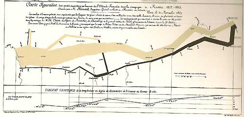
Make no mistake. Tufte is brilliant. He didn’t invent either one of these graphs, but he popularized them in his book, The Visual Display of Quantitative Information. In both cases, click to enlarge.
Here is a Paris train timetable:
And here is a chart of Napoleon’s Moscow campaign. The thickness of the line is proportional to the number of men remaining, and the bottom line is the temperature, which tracks from right to left, as it follows the retreat:
They’re brilliant, simple, clean, and convey huge amounts of information.
Nussbaum is right when he says that this is a smart choice, although I think just emphasizes that the Administration thinks their stimulus problem is one of presentation rather than substance. Bad data can’t be fixed by good presentation, at least not honestly, and I wonder if and when Tufte will get frustrated with the lousy data he’s being asked to present. In fact, it may almost be worse if he succeeds. We’ve seen how poor the stimulus data is already, and superb presentation will only act as propaganda.
For an example of equally inventive data visualization, see here. (h/t: Powerline)


