Archive for category Design
Lies, Damn Lies, and Infographics
Posted by Joshua Sharf in Business, Design, Economics, PPC on August 29th, 2011
This is what happens when people get outside their area of competence. FastCoDesign.com has its Infographic of the Day, and it can be a delight to behold.
But sometimes, like people who fell in love with the Obama “O,” they end up missing the flaws because they’ve fallen in love with the graphic design. The infographic on “Do Green Jobs Really Exist?” is a case in point, as the comments make clear. Here’s the graphic they like:

To his own surprise, Mr. Kuang concludes that Green Jobs not only exist, they’re pretty good jobs for middle-class workers, who don’t necessarily need advanced degrees.
But that was never in question. Of course, green jobs exist. But what the graphic doesn’t show is that while they’re well-paying, they’re also incredibly expensive and heavily subsidized, much moreso than oil and gas are, for instance. On a per-unit-of-energy produced basis, they’re even more expensive, which means they’re a massive misdirection of resources, sapping the vitality of other industries which could employ far more people for the same price.
What’s a little disturbing is that Kuang thought that the argument was about the existence of the jobs, rather than their price-to-value ratio. Admittedly, one data point is a thin reed on which to base a concern. But it does suggest that we need to do a better job articulating the Bastiat-Hazlitt concerns about subsidies if we’re going to win this argument.
Helvetica
Posted by Joshua Sharf in Design on June 8th, 2010
Yes, I recognize the irony of the title, having serifs and all. Turns out it turned 50 three years ago, and someone made a movie about it.
The worst part of sitting through this film is that I find myself staring at the world’s typefaces, even while I’m driving. “Wow, yes, TOYOTA really is in…” screeeeeech! (Full disclosure: so is, “Jeep.”) The prices at King Sooper: yes. The aisle information: no. The Space Shuttle: yes. The London Underground: no.
You have to wade through a certain amount of pretentious twaddle, designers saying things like, “Helvetica is sort of the socialism of fonts, because it’s out there, and people can do whatever they want with it,” which would seem to make it the polar opposite of socialism. It would also seem to be the complete opposite of what Helvetica turned into, so the conclusion is correct even if the reasoning is woolly-headed.
In return, you get a real sense of why Helvetica took over the world:
There was eventually a rebellion, a mad thrashing about that led to little more than chaos. In the end, the designers surrendered. And why not?
Lipstick On a Pig
Posted by Joshua Sharf in Design, Economics, Stimulus on March 23rd, 2010
Bruce Nussbaum over at BusinessWeek reports that the Obama Administration has hired Edward Tufte, probably the most innovative data design guy around, to help explain the stimulus spending:
“I will be serving on the Recovery Independent Advisory Panel. This Panel advises The Recovery Accountability and Transparency Board, whose job is to track and explain $787 billion in recovery stimulus funds.”
Make no mistake. Tufte is brilliant. He didn’t invent either one of these graphs, but he popularized them in his book, The Visual Display of Quantitative Information. In both cases, click to enlarge.
Here is a Paris train timetable:
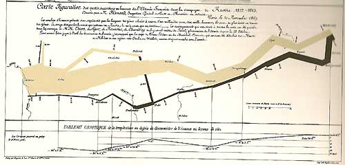
And here is a chart of Napoleon’s Moscow campaign. The thickness of the line is proportional to the number of men remaining, and the bottom line is the temperature, which tracks from right to left, as it follows the retreat:
They’re brilliant, simple, clean, and convey huge amounts of information.
Nussbaum is right when he says that this is a smart choice, although I think just emphasizes that the Administration thinks their stimulus problem is one of presentation rather than substance. Bad data can’t be fixed by good presentation, at least not honestly, and I wonder if and when Tufte will get frustrated with the lousy data he’s being asked to present. In fact, it may almost be worse if he succeeds. We’ve seen how poor the stimulus data is already, and superb presentation will only act as propaganda.
For an example of equally inventive data visualization, see here. (h/t: Powerline)


